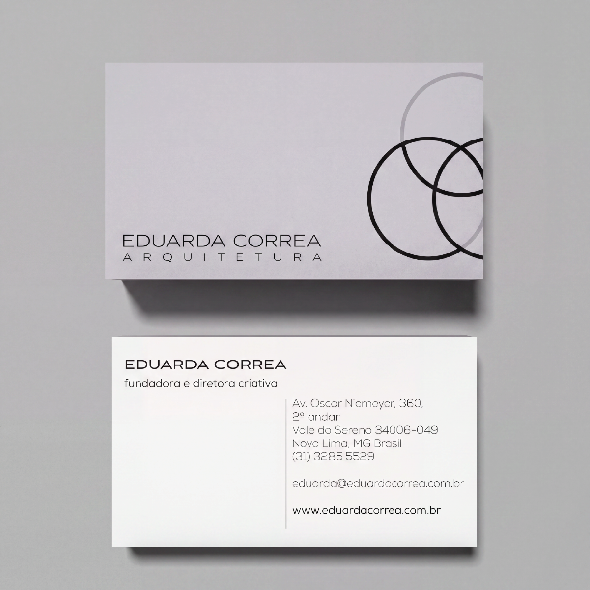
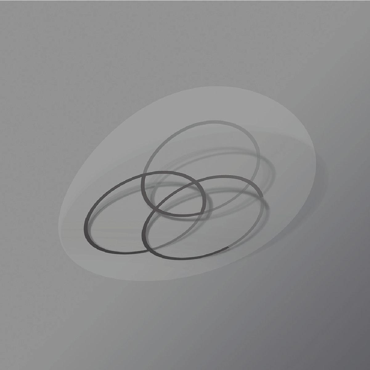
The project evolved the existing identity while preserving the original symbol as an element of recognition and continuity. The new visual language was built around a sans-serif typeface and a neutral color palette, creating a minimalist and elegant aesthetic aligned with the firm’s positioning.
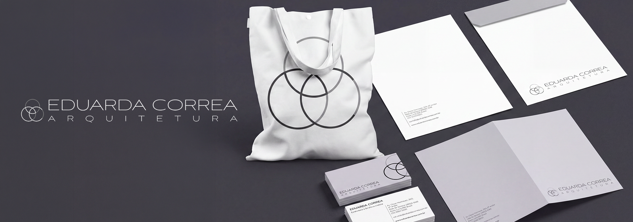
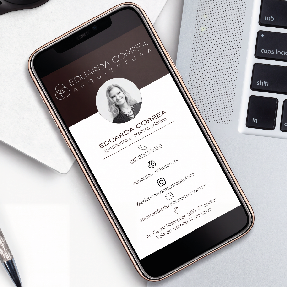
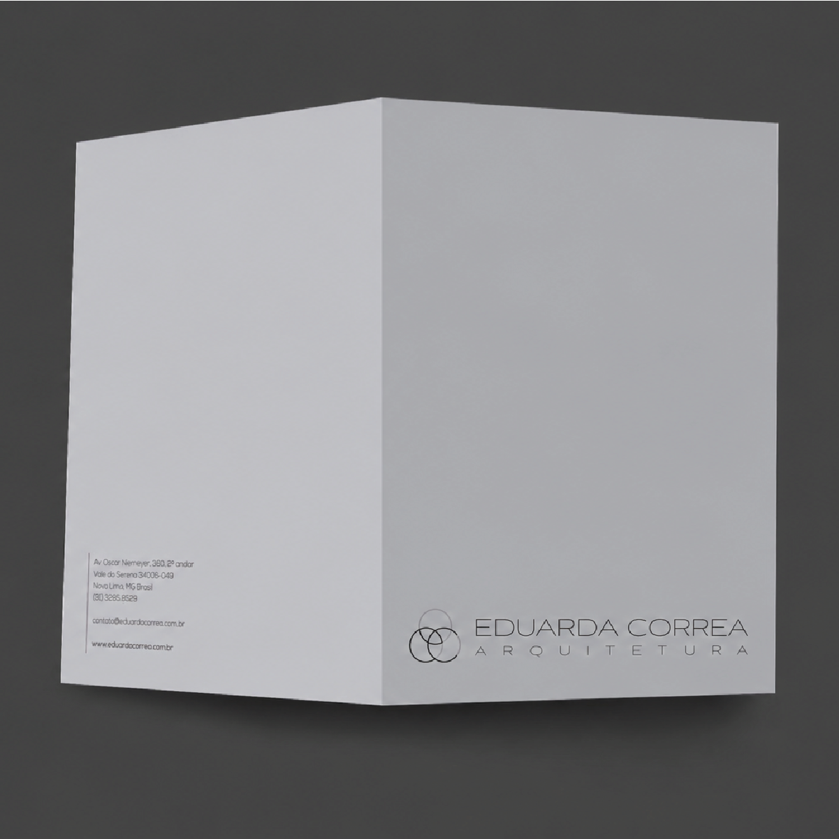
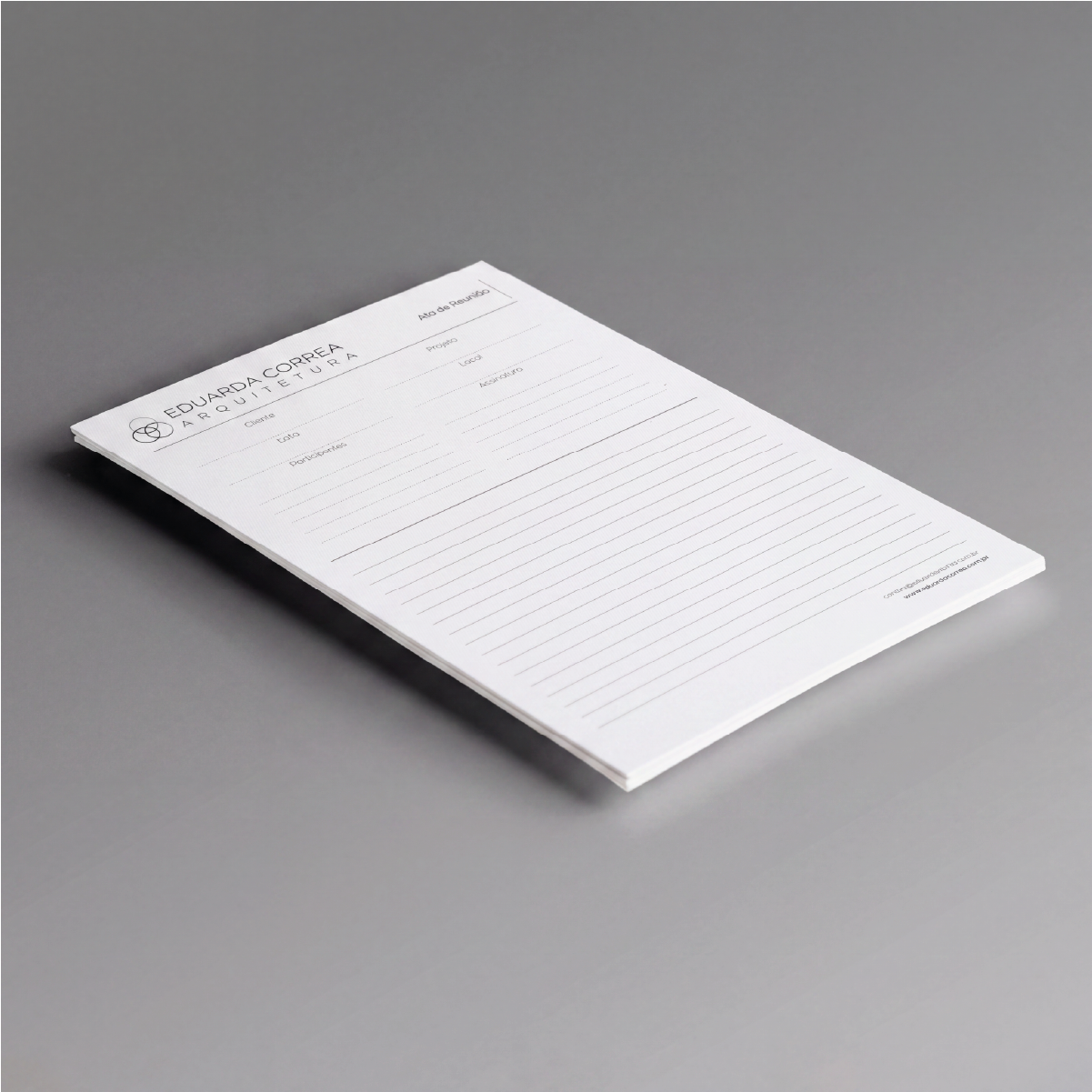
The identity was structured to work consistently across different brand touchpoints. New logo versions and variations were developed, along with institutional materials such as business cards, digital cards, folders, envelopes, meeting minutes, and stickers.
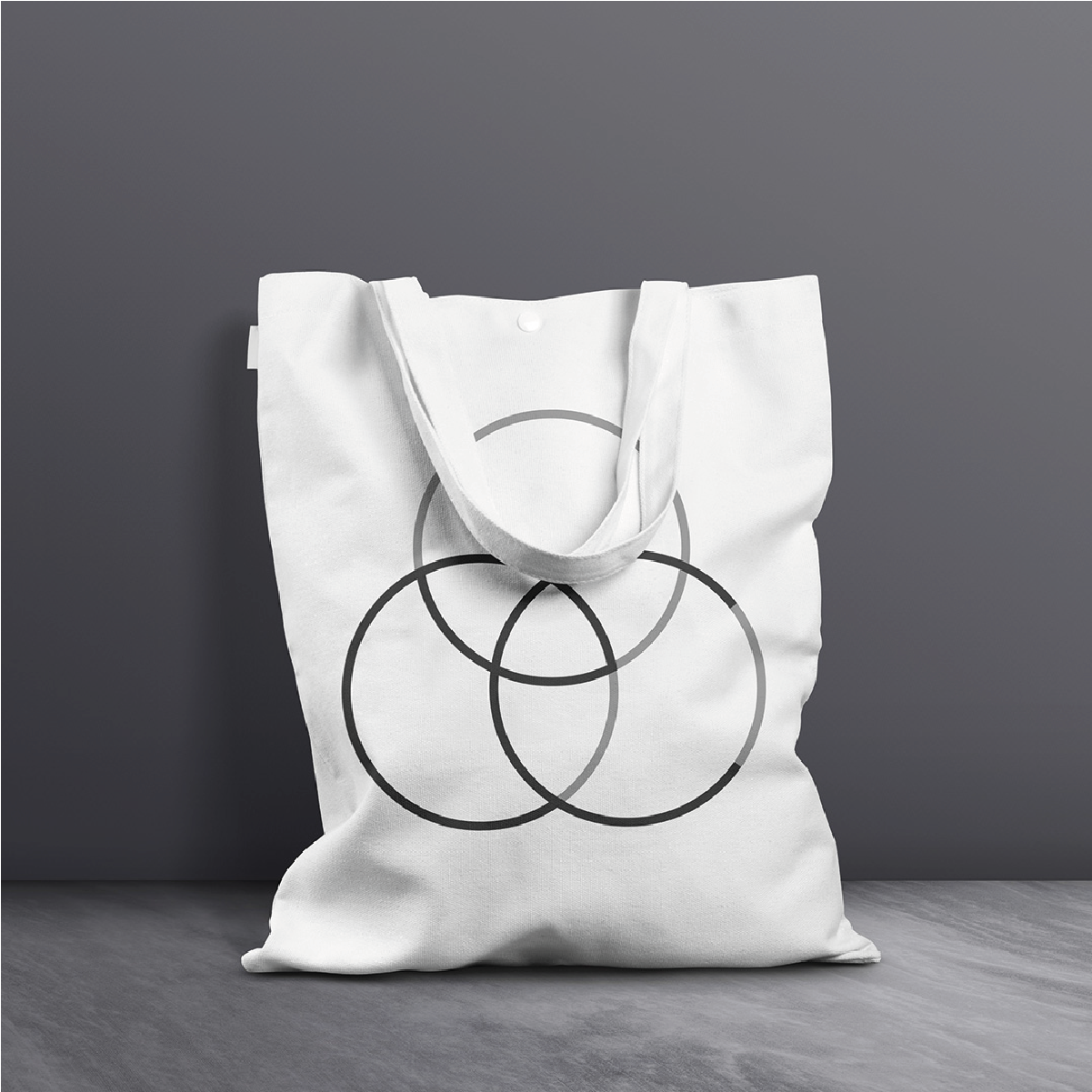
The new identity was also applied to a tote bag, expanding the visual system into different contexts and reinforcing the brand’s presence in a cohesive way.
The result is a more contemporary and sophisticated identity that preserves the firm’s visual essence while establishing a new language capable of representing its high-end architectural projects.
 Portuguese
  English